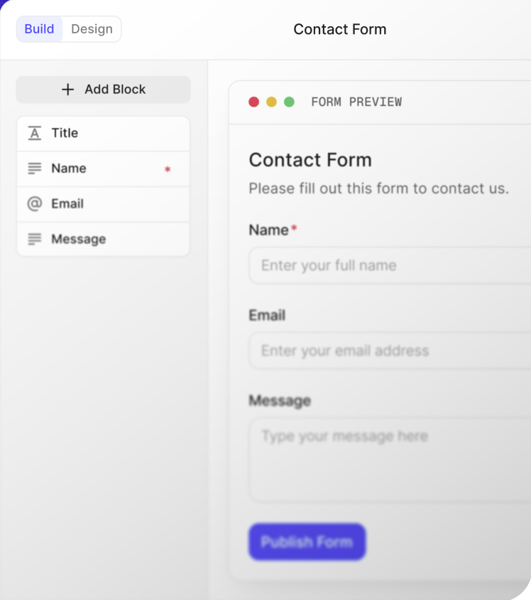
Form completion rises through subtraction, not persuasion: fewer required fields, faster mobile rendering, visible progress on multi-step forms, and error messages that help people recover instead of restarting. The twelve fixes below are ranked by typical impact and need no redesign budget; most ship in an afternoon of edits.
Subtract before you optimize
- Delete every field whose answer changes no downstream decision; each removed field lifts completion.
- Downgrade nice-to-know fields from required to optional, or move them into post-submission emails.
- Replace free-text inputs with dropdowns where a fixed option list serves both sides better.
- Merge first name and last name only when your exports never sort by surname anyway.
Fix mobile friction first
- 1.Stack fields in a single column; side-by-side layouts shrink tap targets below thumb size.
- 2.Use the right keyboard per field: numeric for phones and quantities, email layout for addresses.
- 3.Keep primary buttons full width at the thumb zone, never floating beside content.
- 4.Test on a real phone over mobile data, not just a resized desktop window.
Set honest expectations early
- State the time cost above the first field, then honor it; a promised two minutes must finish in two.
- Show step count and a progress bar on any multi-page or one-question-at-a-time flow.
- Explain why sensitive fields exist in one clause, such as phone number is used only for delivery updates.
Write errors that rescue
- Validate inline as people leave a field, not once at submission when context is lost.
- Say precisely what broke and how to fix it: Enter a date like 2026-09-01 beats Invalid input.
- Preserve everything already typed; forcing re-entry after one mistake loses more than the mistaken field.
Match presentation to length
Short forms belong on single pages where everything is visible at once. Long intake flows complete better one question at a time or section by section, because focus modes hide the intimidating wall of fields that causes tab-closing. If completion sagged after growth, try splitting before rewriting anything.
Templates to start from
Frequently asked questions
- What is a good form completion rate?
- It depends heavily on length and intent: short newsletter signups often convert at multiples of long loan-style applications. Benchmark against your own history rather than published averages, track the trend monthly, and treat any sudden drop as a signal something broke rather than a mystery.
- Why do forms lose so many mobile users?
- Small tap targets, sideways-scrolling multi-column layouts, wrong keyboards, and slow-loading scripts punish thumbs. Single-column stacking, correct input types, and full-width buttons recover most of that loss, which is why mobile fixes rank well ahead of copy changes in priority order.
- How many form fields are too many?
- More than roughly seven visible fields measurably strains voluntary completions, though intent matters more than counts: people tolerate twenty fields for something they applied for and five for a newsletter. Keep required fields under ten and push enrichment into later touchpoints.
- Do progress bars actually improve completion?
- On multi-step forms they reliably help, because respondents can see the remaining effort and decide to continue with full information. On single-page forms they add nothing, since the whole task sits visibly in view and there is nothing left to forecast.
Put this to work on a real form
Free plan, unlimited forms and submissions, all three presentation modes included.